
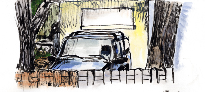
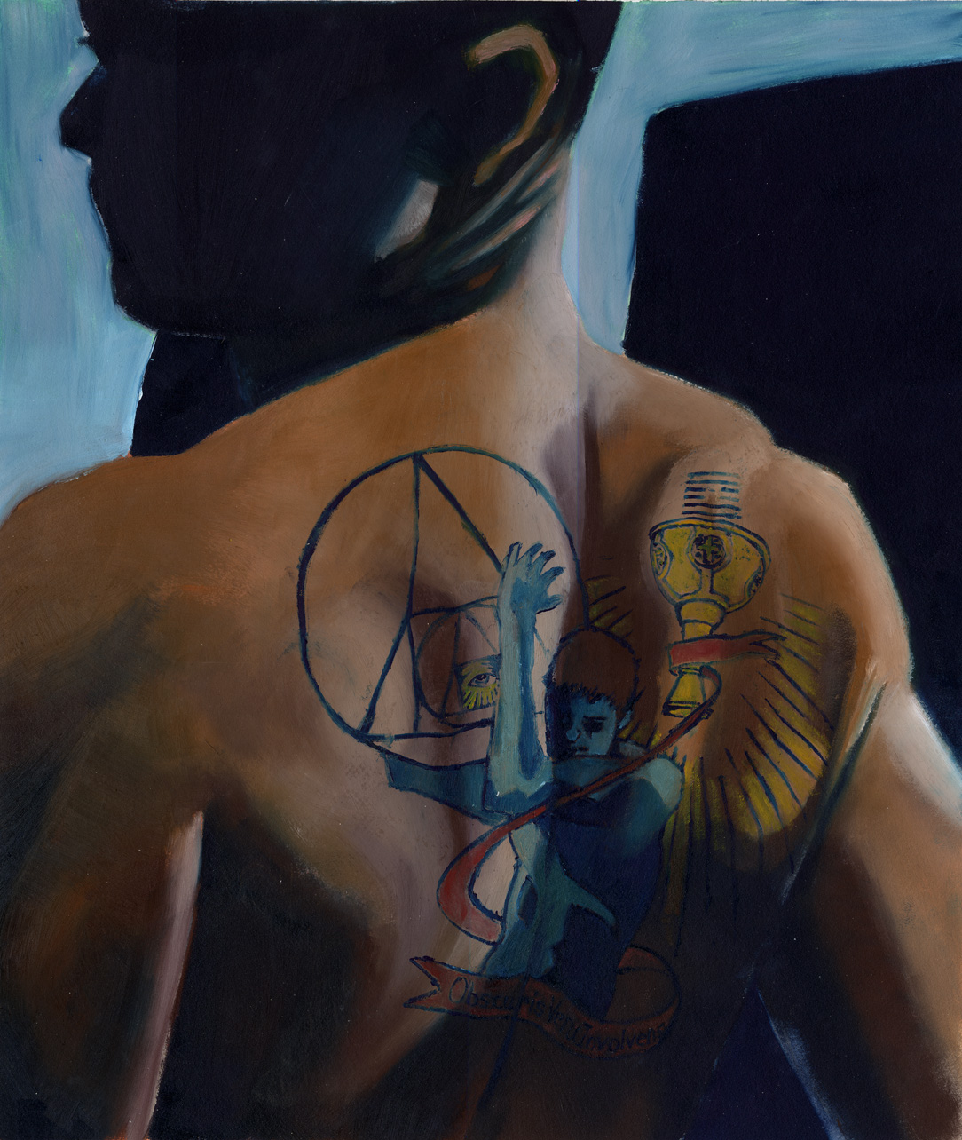
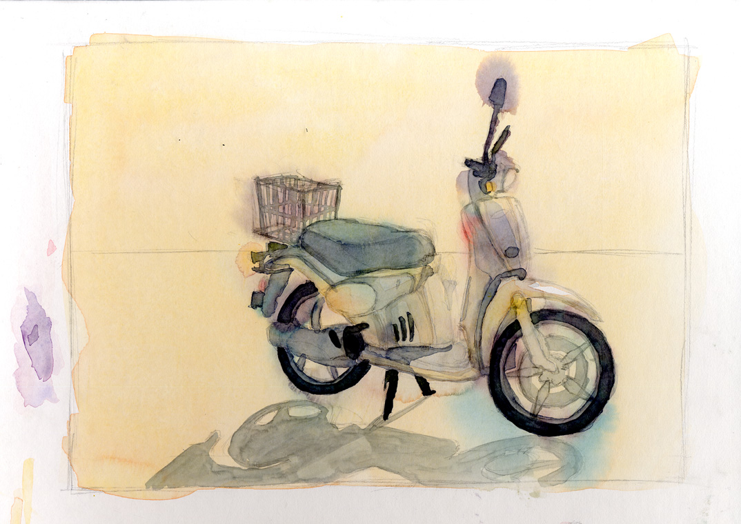
Well this is the first update in a while. It's all I have right
now. These are a few of the more successful things I did
during my first semester at Ringling. I hope you can fi-
nd something in them you like. You'll have to click on
them to see the whole thing. I apologize for the inconv-
enience but it was the best way to do it I thought.
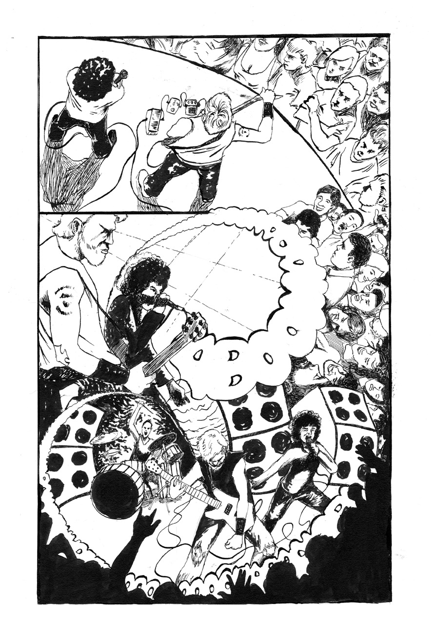
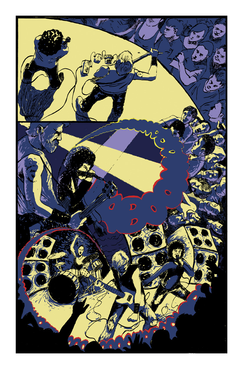
This was the original version of this project. When I started I had intended to use color. In the end I didn't, but I still wanted to go back and see if it would have worked. Let me know which you prefer.
1 comment :
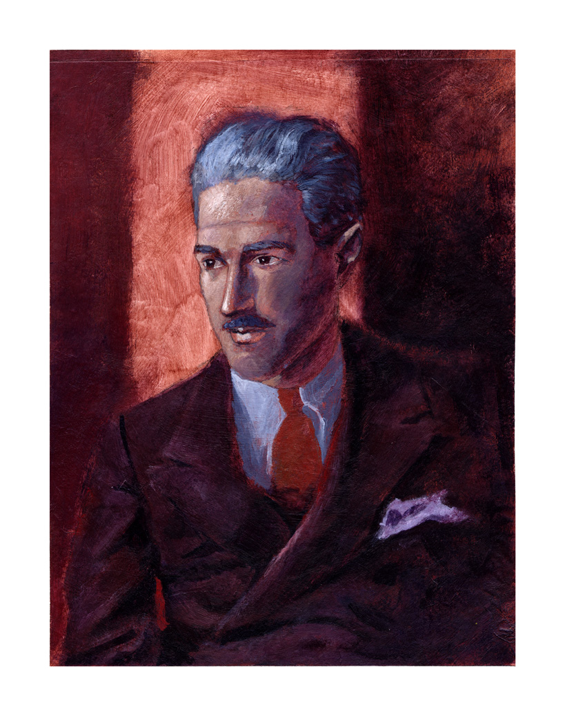
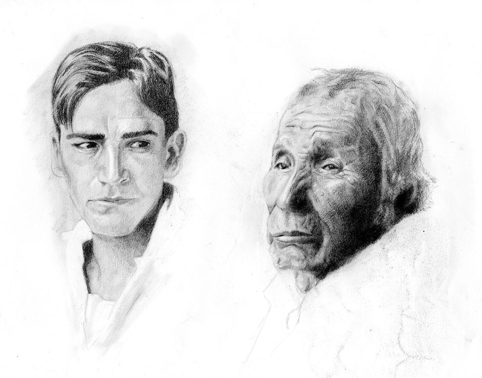
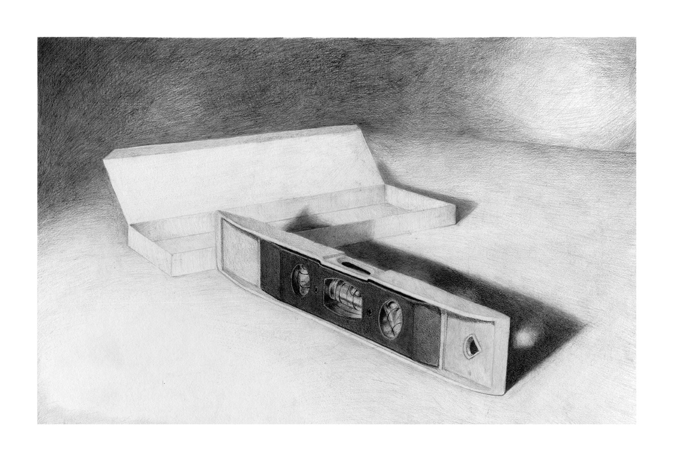
Hey man. Your stuff is looking good, particularly the graphite drawings and the oil rub portrait.
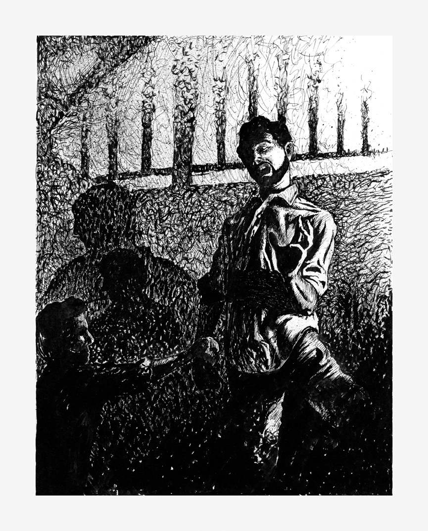
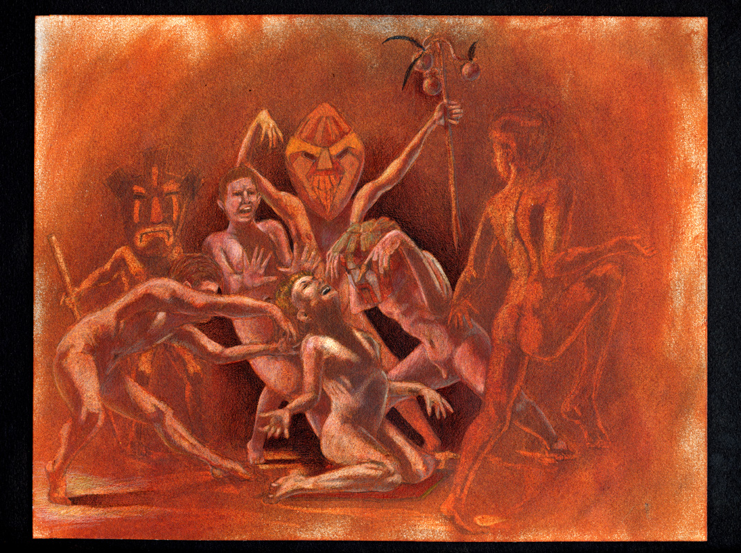
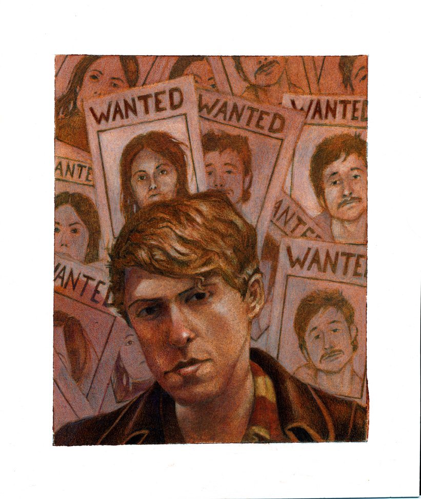
For your other pieces, I like the gestures and the compositions you're getting with the figure's poses, but the overall picture would be more successful if the value structure was simplified. The portrait of Hammett is successful in that regard because the balance between light and dark shapes works. In the ink piece and the dancer oil rub, the shapes are lost due to the conflict of elements that are similar size, shape and value. I would try pushing the background of the dancer oil rub darker to make the shapes readable.
I like the comic page and I think the composition and placement works. My only problem is that I can't read the words due to their shape (again, simplify).
I like what you've got here and you're definitely on the right track. It's good that you're trying to create an entire image with your exercises rather than just copying photos.
Keep at it man,
See you around.
Post a Comment